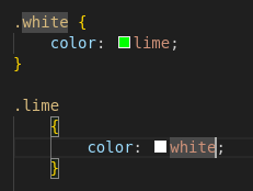
GregorTacTac to Programmer Humor@programming.dev • 9 months agoAverage CSSlemm.eeimagemessage-square86fedilinkarrow-up1567arrow-down119file-text
arrow-up1548arrow-down1imageAverage CSSlemm.eeGregorTacTac to Programmer Humor@programming.dev • 9 months agomessage-square86fedilinkfile-text
minus-square@wizzor@sopuli.xyzlinkfedilink14•9 months agoI don’t get it, isn’t this a pretty normal way of using media queries. Granted you’re more likely to see the widths defined in px.
minus-square@ByteOnBikes@slrpnk.netlinkfedilink10•9 months agoShhh… The poster doesn’t understand CSS and we shouldn’t embarrass them in a community with memes
minus-square@wizzor@sopuli.xyzlinkfedilinkEnglish4•8 months agoMy imposter syndrome kicked in full swing. I was ready to learn a CSS best practice and feel uncomfortable about it for the rest off the day.
minus-square@MonkderVierte@lemmy.mllinkfedilink1•8 months agoNowadays we do responsive webdesign instead of micromanaging widths.
minus-square@usernamefactory@lemmy.calinkfedilink2•8 months agoThis is technically responsive, but I think you have a fair criticism. A single rule like this would be much more maintainable: #content .grid-container { width: 90vw; min-width: 12rem; max-width: 75rem; padding: 2rem 0 1rem; } Obviously, media rules have their place, but not for something that’s consistantly a full width container like this seems to be.


I don’t get it, isn’t this a pretty normal way of using media queries. Granted you’re more likely to see the widths defined in px.
Shhh… The poster doesn’t understand CSS and we shouldn’t embarrass them in a community with memes
My imposter syndrome kicked in full swing. I was ready to learn a CSS best practice and feel uncomfortable about it for the rest off the day.
Nowadays we do responsive webdesign instead of micromanaging widths.
This is technically responsive, but I think you have a fair criticism. A single rule like this would be much more maintainable:
#content .grid-container {
	width: 90vw;
	min-width: 12rem;
	max-width: 75rem;
	padding: 2rem 0 1rem;
}
Obviously, media rules have their place, but not for something that’s consistantly a full width container like this seems to be.